We Spoke to Photoshop Extaordinaire, David Osborn about his images, what makes a good photograph and his new Photoshop workshops
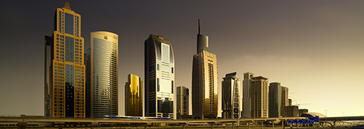
If you visited the Innova Art stand at FESPA in May, or have seen some pictures from the show, you may have noticed some impressive city scenes printed large scale on the stand. These images, from various locations worldwide were created by the London based photographer David Osborn. David has amazing talent with a camera, but, to create images that take your breath away: he utilizes a wide range of Photoshop techniques. We sat down with him to find out more;
Hi David,we had some great reactions to your images on the FESPA stand and would love to learn more about you, your work and your process. To start us off can you tell us how you choose the subjects of your images?
My Images are all a mixture of personal work, commissions and images from the workshops I run. I like very clean compositions and for black and white, a real feeling of mood. Black and White allows for much darker moodier images that are my passion. In my personal and workshop work, I love silky smooth tones in the sky and rich shadow detail.

Edinburgh by David Osborn
When you take an image into Photoshop, do you start with a predetermined plan or does the final image evolve as you work?
You have to have an idea of what you are aiming for. There is an element of the unknown always in the creative, but you do need to have a game plan of what you want the image to look like. As you work on the image you create the final look may vary slightly, but the overall feel I have in my mind when shooting the picture. Indeed the main concept of my workshops is the integration of Photography and Photoshop and that both need to start with an idea; a vision for the image.
In general, people follow a process of shoot the image and then ‘look at it’ in Lightroom later. They see the post production stage as a minor and divorced stage to photography; a mere improvement stage only. Indeed, in my opinion, this is a big mistake for making serious images of quality. Post production is the creative part of the process, not the camera. Cameras just record what is in front of them.
Realising this was the common concept I began my own workshops to teach how Photography and Photoshop are just opposite sides of the same coin, both inter-related and essential to create a good final print and photograph. What governs the whole process from camera to print is Vision, knowing before you shoot what you want the image to look like and using every stage of the process to produce a print the way you want. I feel people rely too much on luck and that means not being in control of the outcome.

Highland Cattle, Cumbria, England by David Osborn
Can you work with any image in Photoshop to create a print image or do you plan the process before you even take the photo?
All images can be improved in Photoshop, but this misses the point. The common mistake is concept. A picture taken without a concept, an idea behind the image will always be lost and have nothing to say. Photoshop is about enhancing the idea so the image communicates the original concept for it being taken. Photoshop can only polish and enhance what already exists in rough form, but if there is no idea; no rough diamond to start with, there is nothing to polish.
There were a lot of complements about your cityscapes that we had on display at FESPA earlier this year, but, this is not all you do. Can you pick one of your favourite landscape pictures and talk us through the process of how you created it – from photoshoot through Photoshop to the final print?
The Castlerigg Stones image below was a lucky shot. I was running a workshop in the Lake District and went to the stone circle expecting a traditional landscape photograph. The sun was just about to go down when we arrived. Instead, I found the lambs were jumping on the stones and playing. I wanted a very simple image and concentrated on this lamb and stone. Shooting a number of frames as it played, I captured this beautiful pose as the lamb looked round. The image is two shots, the sky was flat blue, no clouds at all and so I added a better sky to give the image more the mood I wished. A flat sky would not have the interest being a flat grey tone. The image has been very popular for its grace, simplicity and tone – the key elements of what I believe make a good photograph. The important element is to have a rich palette of tones and the Innova FibaPrint Ultra Smooth Gloss 280gsm gave me a beautifully rich print with good blacks and clean whites, amazing range of greys combined with a subtle paper texture.

Castlerigg Stones, England by David Osborn
Do you always have the final display environment in mind when you are working? For example would you edit an image differently for an office environment with no natural light, than you would for a home environment with a lot of natural light? Do you also have to consider the paper you are printing on when you are editing an image?
In general I produce images that I like and make the print the way I feel is best – I would have no idea of where a print will end up. However, if I get a commission for a particular location, a luxury restaurant for example – and this has happened in Switzerland for me. Then the photography and paper choice must be built into the overall game plan. The ‘look’ must be what the client is looking for and in keeping with the feel of the surroundings and that, in a way, starts with paper choice. What paper would look best in the environment? High gloss or water colour texture for example. In this situation the choice of paper could influence how you approach the photography and equally the Photoshop work because you are working to create an image for an exact environment. You still remain true to your style, but your style may need to be tweaked for the end result to work in a specific location.
You mentioned that you have recently started up your own Photoshop workshops, what can people hope to learn from these experiences, do they need to have any prior knowledge of Photoshop to attend?
I began the workshops unintentionally. Workshops in general fall in two areas: Photography workshops in general are more photography holidays, Photoshop is generally taught in a classroom environment, in an academic setting not a creative setting. I was meeting more and more people who had attended photography workshops who were really frustrated at not having learned anything, because nothing was taught. The workshops were about going home with images, not education.
Equally, I would hear about people attending Photoshop courses and hearing the process they went through, I knew it would have little real life benefit.
I realised, no one (almost) was doing real education workshops. In my workshops the sole purpose is to pass on knowledge and make the student a better photographer. They can be at any stage in photography and Photoshop from a complete beginner to advanced, but no matter what stage they are at, I teach them the whole photography and Photoshop process; a workflow to follow as a foundation to continue their own work . In the digital world today, that means you need Vision (teaching the idea or message you want to communicate), Photography and Photoshop. All three are essential to produce a good print or photograph with meaning. No one was teaching that holistic and complete approach all on one course. I found a need, born out of people’s frustration with many current workshops and the workshops grew from there.

Castle Coombe, England by David Osborn
You print your own images to sell, what is it that you look for in a digital paper, and, do you have any particular papers that you prefer to print on?
Paper is an important part of Vision as photography or Photoshop. The texture and look of the paper influences the viewers perception, it influences how your image communicates. In simple terms, there is no point shooting an image for incredible minute detail and printing it on a very course paper texture where the detail element of your vision, is lost. Likewise if your vision is a much freer feel in the image then a course textured paper may enhance your vision. Paper choice and vision go hand in hand. My personal choice is the Innova FibaPrint Ultra Smooth Gloss 280gsm. The reason is that it has a beautiful subtle texture. A pure non-textured paper would be too cold, yet too much texture would hide the detail I like. Equally, for my work, I feel a pure matt paper loses some sparkle and an ultra-high gloss feels also feels too cold. The FibaPrint Ultra Smooth is a beautiful balance between the paper texture and sheen; it creates beautiful rich tones similar to the darkroom fibre prints I did for so many years. The beauty of Innova papers is the fact that they have a beautiful range of papers that you can match up to your personal vision for your image.
Thank you for taking the time to talk to us David.If you are interested in attending one of David’s Photoshop workshops, he can be contacted through his website (www.davidosborn.london) where you can also see more of his work or speak to him about commissions.
This story was delivered directly to our subscribers, if you would like to recieve similar stories and other exclusive content, click here, to sign up to our newsletter.
Leave A Comment